reducing
designing
debt
e-Commerce
Security Disclaimer
In accordance with Government and USAF security protocol, product details, data, and elements of the product UI have been redacted and/or obscured.
Process at a Glance

Product Overview
Product Type:
USAF web application
Product Type:
e-Commerce web application
BLUF (Bottom Line Up Front)
Problem Statement
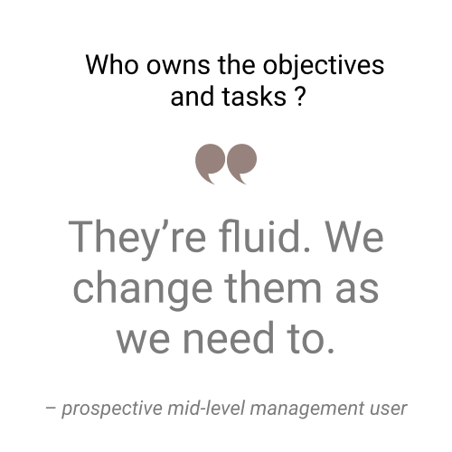
Branch Leadership needs a way to track app teams' delivery of high- and mid-level tasks so that they can better direct mid-level management, and so that they can provide accurate updates to key stakeholders.
Branch leadership requires attractive data visualization and expedited delivery.
Users & Consumers
User Experience Solution:
I believe that by creating an e-Commerce system for Newbury Yarns customers, we will make knitting and crochet shopping a more accessible, trustworthy, and personal experience.


Branch Leadership specified that the app needed to serve two specific groups:
App teams
As users:
inputting data on story & epic completion
As consumers:
seeing upcoming milestones and future intersections of work with other teams
Leadership
As users:
inputting milestones and deliverables
As consumers:
seeing the completion tracking of teams' data entry, using it for stakeholder briefings
Challenges & Responsibility
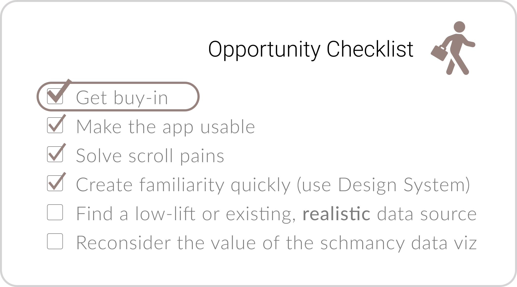
My responsibility as the sole designer on the team was to buy down risk.
My tasks to do this included:

Make the product valuable enough to win user and consumer adoption by app teams, leadership, and stakeholders.

Determine what is valuable to users, consumers, and stakeholders through engagement and testing

Spend time and resources wisely; ensure we avoid reinventing the wheel, apply frugality to innovation
I discovered that there were five main challenges to solve.
Each challenge had associated risk.

Challenge
There were no records of research or synthesis to support the product decisions.
Associated Risk
Time spent backtracking in order to understand the current iteration.

Challenge
Design pages for the product were no longer accessible due to deprecated software.
Associated Risk
Potential for delayed delivery of new design iterations and UX/UI improvements.

Challenge
The organization's design sytem was not used to create the existing product.
Associated Risk
Potential non-acceptance by stakeholders; Possibly days to rebuild in adherence.

Challenge
The team to date had engaged with only one user/consumer out of a base of many.
Associated Risk
User DRIVEN design whereby the product only suits one user.

Challenge
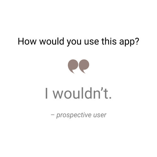
Reluctance. When I showed the product to users, none wanted to use it.
Associated Risk
Buy-in. Getting teams to and consumers to help craft a useful product for their work.
Taking action: The Audit
How I Discovered the Problems
I determined the maximum context gain over the minimum amount of time and planned a one-week lean audit.
This time gave me the answers and insights to inform my next steps without costing delays in development because a week's worth of stories existed in the backlog.
Day 1: Meet that one engaged user / stakeholder
• Expections for other users and consumers
• Summary of previous interviews
• Where is the desired data coming from?
• Evaluation of current features & functionality
Result: Minimum valuable research documentation
Study the Company.
To design a sustainable e-Commerce platform for Newbury Yarns, I pursued learning about the business's:
• Values and mission
• Administration and staff
• Relationship with the community
• Revenue streams
• Product inventory

Day 2: I studied the current the UI / UX.
• Why the app doesn't use the design system
• Experience the current heuristics
• Test drive the affordance and learnability
• Discover all of the features and functionality
Result: Viable knowledge posture to conduct interviews
Study the Clientele.
I got to know knitters and crocheters, and their shopping habits for projects, including:
• Who are they - demographics
• Why they shop where they do
• What informs the product purchases
• Getting help - for what, why, when
Days 3 & 4: Interview intended users and consumers
I gave 8 previously unexposed and prospective users an intended task and observed
• Five app team members who'd contribute progress data
• Three mid-level leaders who'd input milestones
Result: Hierarchy of pain points and heuristic evaluation
Study the Company.
To design a sustainable e-Commerce platform for Newbury Yarns, I pursued learning about the business's:
• Values and mission
• Administration and staff
• Relationship with the community
• Revenue streams
• Product inventory

Day 5: Understand the back end and basic architecture
I talked to the engineers about
• Data source for what was displayed
• Tech stacks + are we in prod? Staging?
• Potential for design system usage
• Origin and use case for the snazzy data viz
Study the Clientele.
I got to know knitters and crocheters, and their shopping habits for projects, including:
• Who are they - demographics
• Why they shop where they do
• What informs the product purchases
• Getting help - for what, why, when
Result: Exposure of tenuous legitimacy
• Existing data was fake because the "data source" was an incomplete spreadsheet
• Data to support snazzy data viz didn't align with program development
Synthesis:
How I Figured Out What to Do
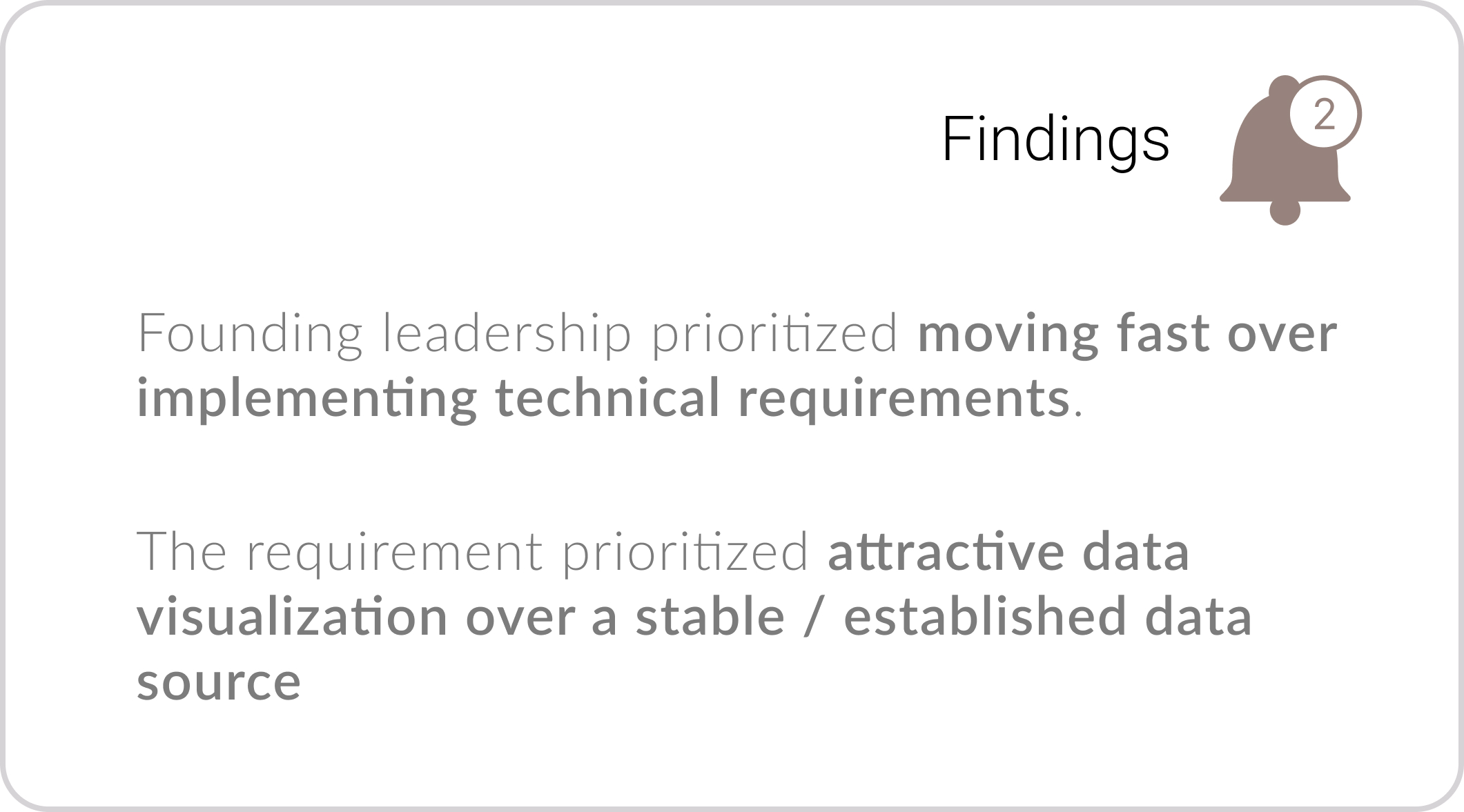
From the audit, I found that the tech debt was prescribed as two informed choices by leadership.

If it costs you 200 hours later to do it in 40 hours now, do that.
– founding stakeholder/user
Yeah, we skipped all of that to prove the concept faster.
– developer team member
{Leadership} loved these graphics and thought they'd be a great selling point.
– developer team member
The prescription to have attractive data graphics manifested in costly visualizations.
The data source for them was yet to be determined.
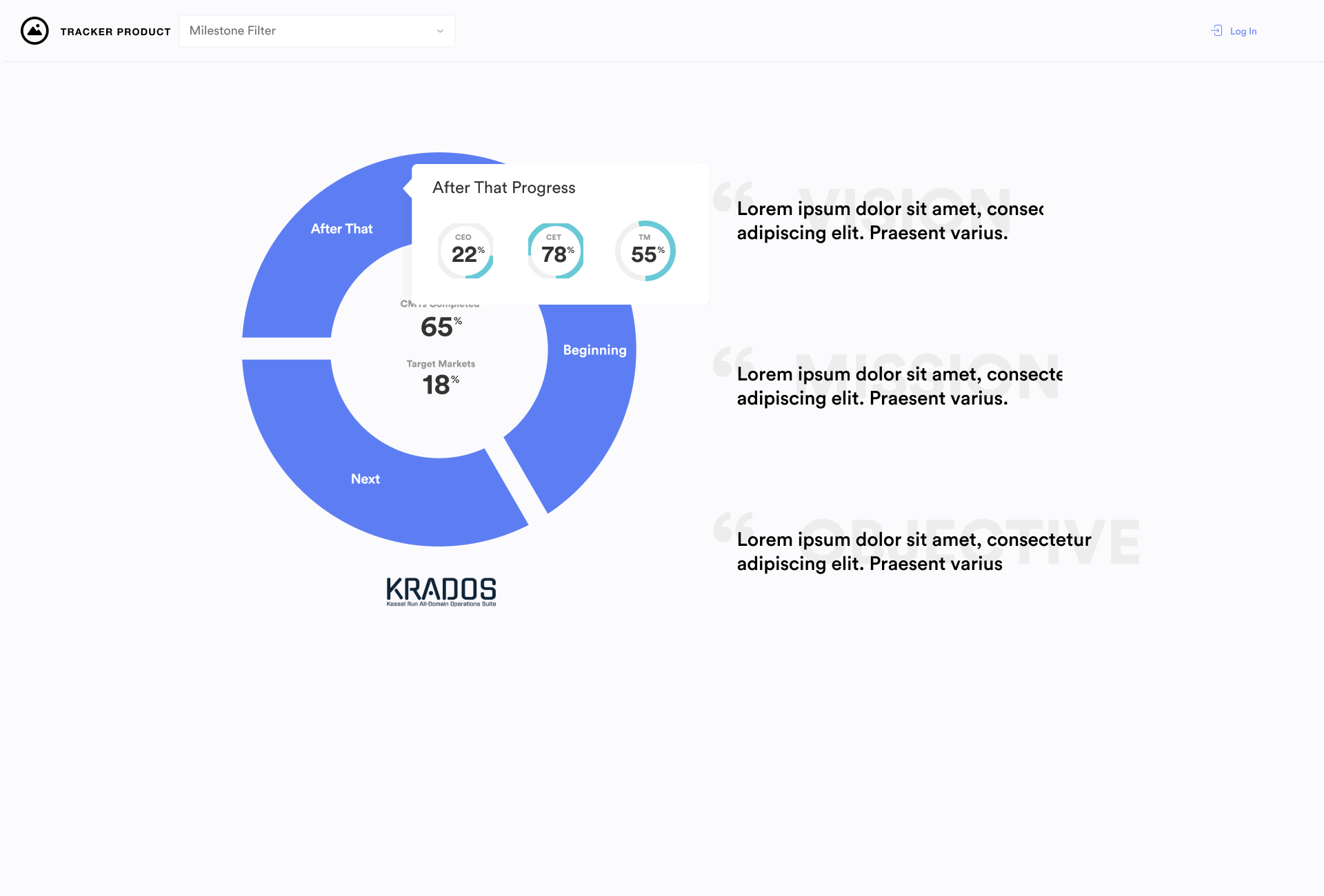
the "doughnut"
the "arc"
Data, and elements of the UI have been redacted and/or obscured for security protocol.
Dummy data has been added in replacement.
The insights were decision-drivers to:
• Pursue buy-in
• Persuade users to commit to providing data through UX and UI choices
• Find data that could support snazzy graphics
From the audit, I found that the design debt was subscribed (not prescribed, as the tech debt). The past choices to neglect user testing were costing buy-in at every turn.
This horizontal scroll is flying back and forth on my trackpad.
– prospective user
I don't know what I'm supposed to be looking at.
– prospective user
I've never seen this data before, what is it?
– prospective user
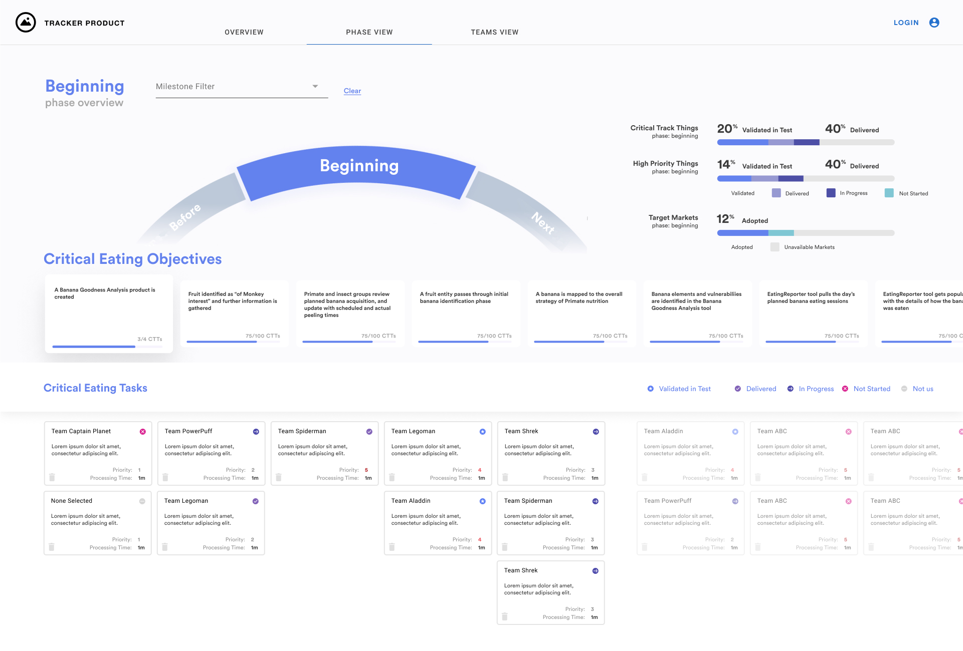
Existing UI
Data, and elements of the UI have been redacted and/or obscured for security protocol.
Dummy data has been added in replacement.
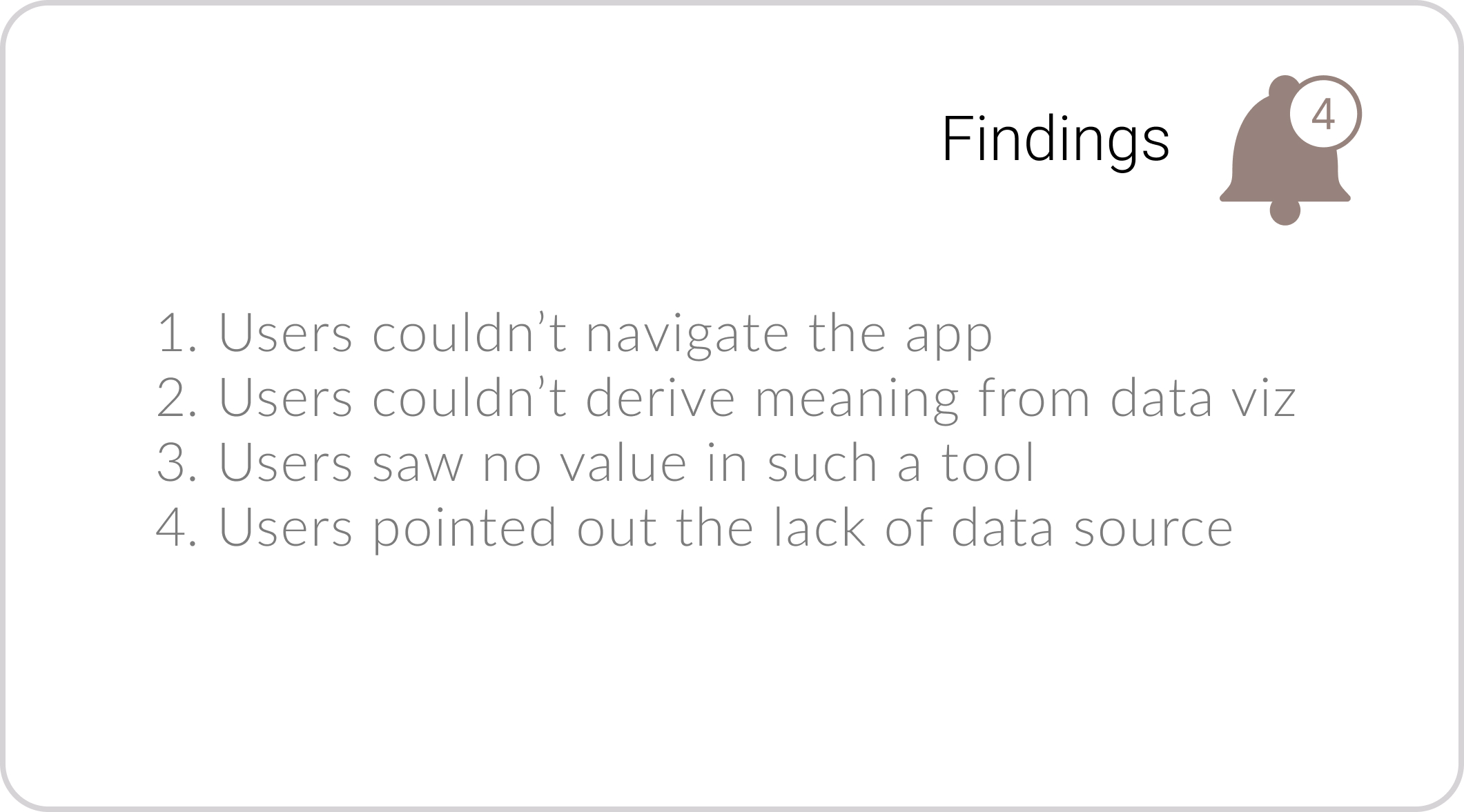
Insight 1
Most users were experiencing the app on a laptop with a large trackpad. The horizontal scroll to peruse Phases, Objectives, and Tasks did not function.

Insight 2
The fancy graphics weren't useful, and users didn't know how they were being calculated (the dummy data didn't correlate to actual available data). The unfamiliar UI components obscured the purpose.
Insight 3
App team PMs and mid-level management did not think the concept of the app would provide value for two main reasons:
• duplicative effort to existing tools
• reluctance to maintain yet another tool
Insight 4
The data source is a spreadsheet that presents a few risks:
• Data is pasted in from the existing tools
• Spreadsheet is updated as an afterthought
The "yardstick" changes constantly, which would make it hard to measure progress against it.
These insights were decision-drivers to:
• Make the app navigable (solve the pain of horizontal scroll)
• Run a lean experiment to see if realistic data jumpstarts buy-in
• Use design system components (solve the pain of unfamiliarity)
• Spike on integrations with existing data sources
• Customers want guidance resources in two formats:
- pro-crafters who can talk about the products with firsthand knowledge, and
- self-guided help in size charts, tutorials, inspiration galleries, and self-built kits
• The target audience has a split opinion on price impact:
- 50% prioritize price point alone and are loyal to the lowest costs
- 50% are willing to pay more at brick & mortar shops because of the expert guidance and tactile experience.
• 100% of customers are adamant about touching a yarn before buying it in full
- 100% of customers voiced skepticism with yarn shopping online
• All interviewees said most purchases stem from seeing an inspiring display:
- finished knit/crochet projects, skeins in color arrangements, "featured" yarns, etc.
Design Experiment
How I Did The "to do"
From the audit findings and synthesis, I had a list of things I could do to buy down risk and address the tech and design debt.
I could solve the most blockers and the major blocker to buy-in with quick and easy UX/UI fixes + some user testing.
Strategy: Move fast
• Get concepts out there + test
• Make it pretty later
• Cheap wireframes & prototypes
Strategy: Throw it on the Wall
I made 3 variations of UI & user flow knowing that three choices yield more engagement with users than two.
Variation 1: "The Snack Bites"
I kept the rectangular tiles to hold the content of the Objectives and Tasks.
I turned the phase "arc" into a static linear bar to alleviate movement pains.
I converted horizontal scrolls into vertical scrolls for "normalcy."
I mimicked a feasible API with existing product management tool to reduce double-entry
Data, and elements of the UI have been redacted for security protocol.
Dummy data has been added in replacement.
Variation 2: Directory-inspired
I drew inspo from file directory patterns to clarify orientation and show hierarchy.
I turned the phase "arc" into a static linear bar to alleviate movement pains.
I converted horizontal scrolls into vertical scrolls for "normalcy."
I added a feasible integration to the existing project management tool to reduce "double thumping."
Data, and elements of the UI have been redacted for security protocol.
Dummy data has been added in replacement.
Variation 3: "Panes for Pains"
I broadened the Objectives panel and put Tasks in their own pane.
I turned the phase "arc" into a static linear bar to alleviate movement pains.
I converted horizontal scrolls into vertical scrolls for "normalcy."
I added a feasible integration to the existing project management tool to reduce "double thumping."
Data, and elements of the UI have been redacted for security protocol.
Dummy data has been added in replacement.
Testing through "Rapid Feedback"
I went back to the original eight prospective users scheduled 20 minute blocks for "rapid feedback" over the course of two days.
We spent five minutes on each prototype, and got their sentiments on whether we could validate a new UI.
I like the vertical scroll much better, it’s what I would expect.
I like being able to see that multiple teams are working on the task.
I like how much information I’m getting without having to open anything.
Feedback results & iteration drivers
• Reordering the legend of the status indicators for logical progression
• Put phase labels in the side pane list for streamlined viewing
• Remove a level of drawers because isn't worth the extra clicks
• Remove the data flow because it doesn't create additional value
Successful Rapid Feedback: overall improvement; next steps are clear
The new design
I leveraged the winning UX and UI concepts from testing, added in the design system components, and created it on a grid for faster implementation.
Details, data, and elements of the UI have been redacted and/or obscured for security protocol.
Dummy data has been added in replacement.
SO... HOW DID IT GO??
The Results
I DID solve the major blocker of user buy-in through user-centered-design and iterative testing. Yay!
BUT
We still had the big problem of a data source, though.
• I proved that the spreadsheet was an unsustainable dependency
• Measuring progress depends on a stable unit of measure, which didn't exist
A Final Experiment and... The Closing.
Through my research and user engagement, it was increasingly clear that what was needed was a robust project management tool.
The capabilities leadership was asking for were widely available in many commercial products.
I drove an experiment...
- Selected a commercial tool
- Populated it with realistic unclassified data
- Utilized color, tagging, and other features to indicate progress
- Leveraged features of built-in data visualization
The concept is proved!... Now, the hard decision.
After a few hard days thumping in our pseudo data, I knew I'd proved the concept and had a duty to save taxpayer dollars.
I knew I should show our findings to leadership.
The last meeting.
The team PM and I called a meeting with leadership to demonstrate that our hypothesis checked out – custom software was not needed to produce the results they desired and that it would save millions of dollars by moving forward with a commercial tool.
Leadership did cancel the app. I was proud to demonstrate that I'd learned how to lead, be frugal, and make difficult decisions.
2022. Katharine Britten Howard