case study
designing
UI Usability
e-Commerce
ISR app
for Newbury Yarns
Security Disclaimer
In accordance with Government and USAF security protocol, product details, data, and elements of the product UI have been redacted and/or obscured.
Process at a Glance

PRODUCT OVERVIEW
Product Type:
USAF web application
Product Type:
e-Commerce web application
The App's General Problem Space:
Warfighters need a way to:
Efficiently task complex and multi-faceted chores to the objects with the capabilities to complete those chores: across and within areas of operation, and with user interfaces that accommodate various releasabilities.
So that:
They can create and revise a plan, present streamlined visuals to brief Generals, and produce specific artifacts for dissemination to the appropriate departments and front-line warfighters.
Problem:
Knitters and crocheters need a way to browse and buy supplies online because they cannot always make it to the store to make their purchases.
The Challenges at Hand:
- The existing process to plan missions is laden with manual workarounds.
- Data must be clean and clear to avoid security errors.
- Associated legacy systems are unreliable: they crash and lose data.
- The majority of work at TS-SCI level of classification hinders communications.
User Experience Solution:
I believe that by creating an e-Commerce system for Newbury Yarns customers, we will make knitting and crochet shopping a more accessible, trustworthy, and personal experience.
Meeting the Challenge:
Though minimal research-related artifacts existed when I joined the team,
we were able to travel and spend two full weeks with users at an Air Operations Center (AOC) to conduct fresh research.
Business Benefit:
e-Commerce will boost Newbury Yarns' position in the marketplace of suppliers, its integrity within the community, and its gross revenue.
RESEARCH & DISCOVERY

I created and executed a research plan and methods to meet the challenges:
- Gaps in the understanding of the users and their needs
- Research and comms in a CLASSIFIED problem space
Learn more about Product Design for CLASSIFIED problem spaces

Method: DSN calls
- Feedback on recent releases
- Discussions on new issues
- Learn gaps and priorities
- Review emailed designs
(UNCLASS)
Study the Company.
To design a sustainable e-Commerce platform for Newbury Yarns, I pursued learning about the business's:
• Values and mission
• Administration and staff
• Relationship with the community
• Revenue streams
• Product inventory

Method: Email
- Outreach & introductions
- Scheduling
- Follow-up conversations
- Quick questions
(can be SECRET or UNCLASS)

Method: Site visits to AOCs
- Immersive contextual inquiry
- Paper prototypes and card sorting
- Design iteration and printouts
(CLASSIFIED)

Method: Primative design tools
- Sketch/notepad and pen
- Design iteration via whiteboard and printouts
- Sticky notes
(no laptops allowed in on site)
KEY LEARNINGS & DE-RISKING

Assumption: All users of the product can see the same releasability and classification = FALSE
- A non-US servicemember – who is subject to a different releasability – shares the job with our USAF primary user.
- The USAF member needs an efficient way to prioritize the completion of certain tasks in order to complete the remaining tasks with their Coalition counterpart.
Assumption: Data used from a legacy system is reliable and accurate = FALSE
- Parsing the important parts is only as good as the information being parsed is, and is dependent on a functioning legacy system
- Users have created workarounds to identify faulty requests.
- Users need a way to modify flawed requests so that they can create viable taskings
Assumption: Product X marks the end of a workflow across all AOCs = FALSE
- The different areas of operation call for different methods of working within them, and therefore different workflows
- How might we create an enterprise solution that will meet the needs of users across AOCs?
VALIDATION-BASED
UX & UI IMPROVEMENTS
After conversations, visits, and other dialogues with users, we feathered in some UI re-factoring to support the users' main needs.
Example A
Details, data, and elements of the UI have been redacted and/or obscured for security protocol.
Dummy data has been added in replacement.
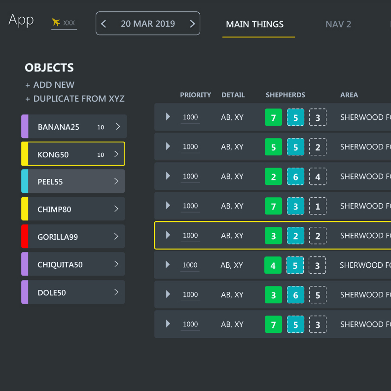
Current Design.
The original designer had a great solution in putting objects on the left and chores in the main pane, and users were already familiar with that interaction habit.
Usability Problem.
There was no UI signal to differentiate a hover state of items, and no selected or hover state for chores. The task flow is to click on an object on the left pane, then click on a chore in the list to create the assignment. Without an indication of the object state, a user would need to remember which object had been clicked on.
The list of {objects in need of tasking to the chores} – as well as the list of chores – were quite long, and we learned in contextual observation they frequently lost track of which object they had selected when trying to task it to a chore.
Details, data, and elements of the UI have been redacted and/or obscured for security protocol.
Dummy data has been added in replacement.

Usability solution 1: state awareness
I created a hover states and a selected states for both objects and chores. By giving a user a state-awareness interaction, they could differentiate available functions and have a clearer path to create assignments.
I also removed the "click bar to assign" because it occupied valuable real estate in the table of chores. I contemplated implementing different visual cues for the process of creating assignments because I didn't not find the UI intuitive. But I am not my user, and because they did find it intuitive, we left it, and the dotted lines to indicate unfulfilled sub chores in the chores list.
Usability solution 2: "less is more" with color.
I altered the application of color. Since one of the users' main needs was a clean visual path to task objects to chores, I left a small tab of color to indicate different objects in the list.
An additional benefit to this change supports readability of the name of the objects. In the current state, because light colored objects with white names would be difficult to see, the text was black. This created visual inconsistency in the list of objects. By making the objects in the list primarily grey, we supported consistency throughout the list with white names, whatever color the object might be.
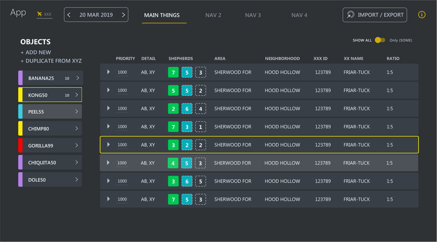
Example B
Details, data, and elements of the UI have been redacted and/or obscured for security protocol.
Dummy data has been added in replacement.
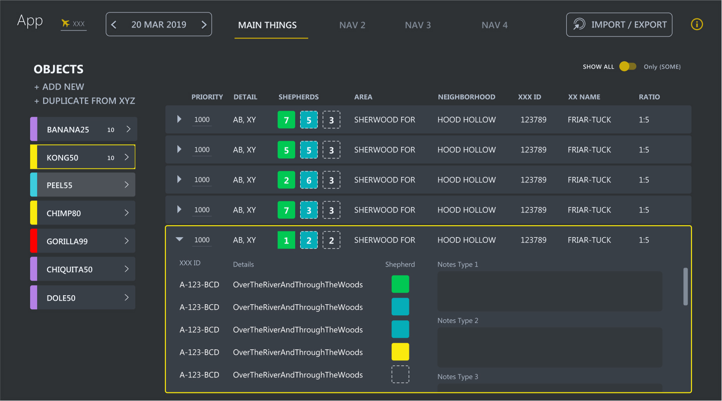
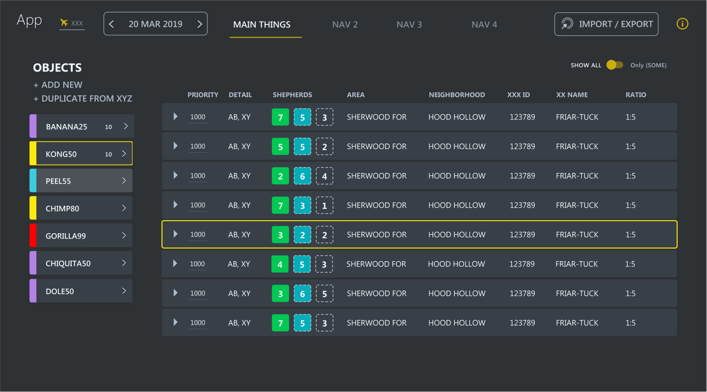
Current Design: Usability problem.
From the main page, users couldn’t decipher whether all of the subchores in the drawer had been tasked, or just some. This problem led to missed fulfillments of subchores.
- The current design was binary: subchores had assignments, or no assignments.
- Users had to open every drawer to see missed assignments.
- The indicators on the main page were only solid or dotted.
Goal: Show users subchores in a drawer are partially fulfilled.
Users needed a way to see – from the main page – if any subchores were unfulfilled.
Details, data, and elements of the UI have been redacted and/or obscured for security protocol.
Dummy data has been added in replacement.
Usability solution.
I created a new fulfillment state – partially fulfulfilled. The "Shepherd" column in this image shows the 3 states fulfillment could be:
- Solid: fulfilled subchores
- Solid with dotted outline: partially fulfilled subchores
- Empty with dotted outline: no subchores are fulfilled
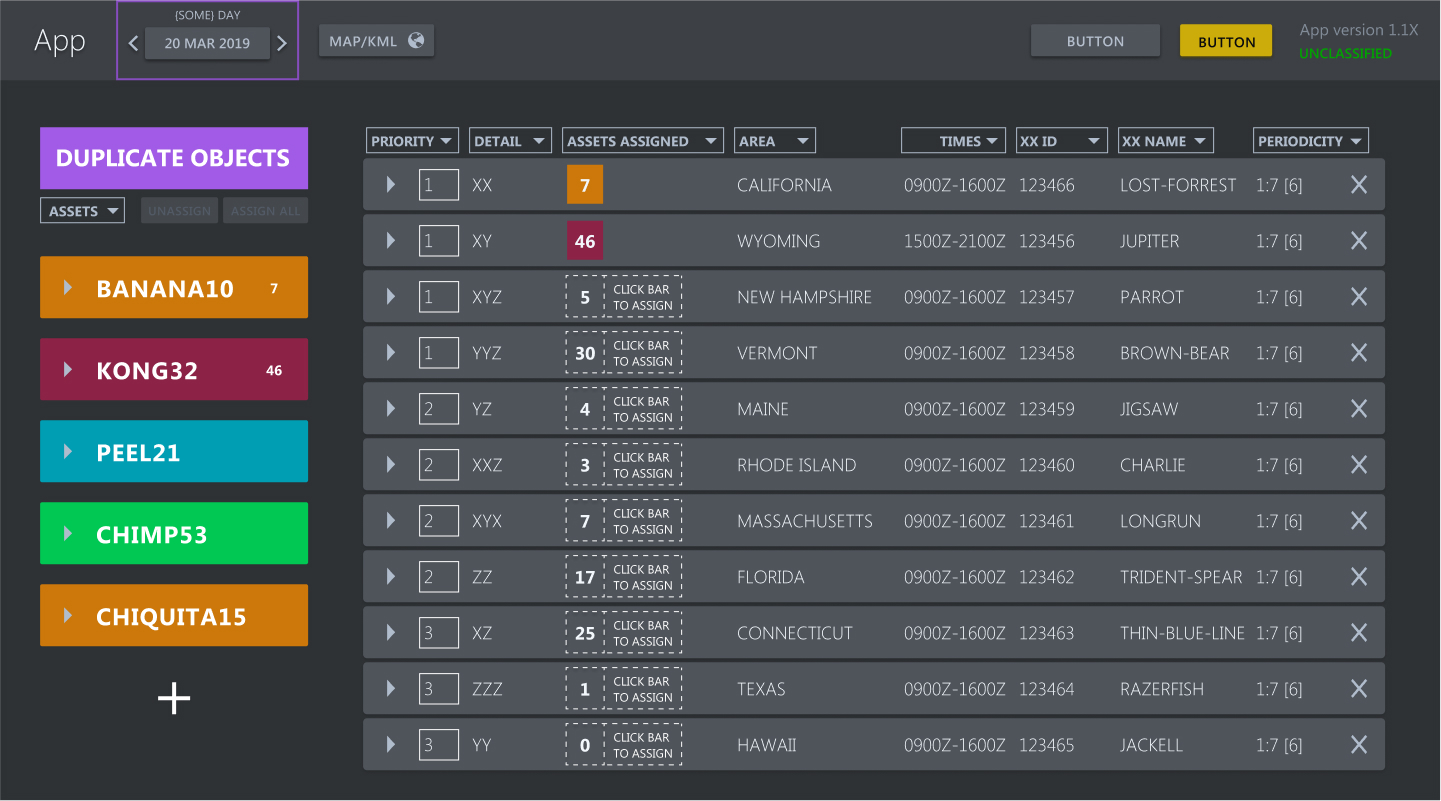
Example C
Details, data, and elements of the UI have been redacted and/or obscured for security protocol.
Dummy data has been added in replacement.
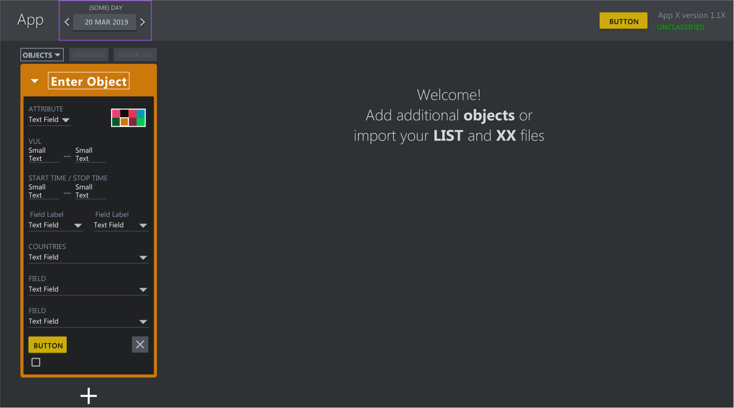
Usability problems.
The button to "Duplicate Objects" looked the same as the object items themselves, causing confusion.
Additionally, the dropdown arrow to edit details of an object was long with many details, requiring a user to scroll down and pay extra attention to each field.
Furthermore, the "+" button to add a new object to the list was at the bottom of it. When the list of objects exceeded the length of the page, it wasn't visible.
Goal: Give users better access to create objects and edit their details.
Allow a user to add objects without scrolling to the bottom of the list, and provide sufficient space for an object's details.
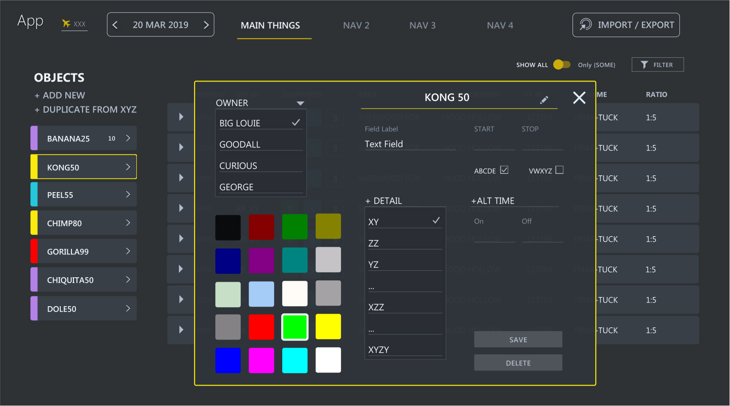
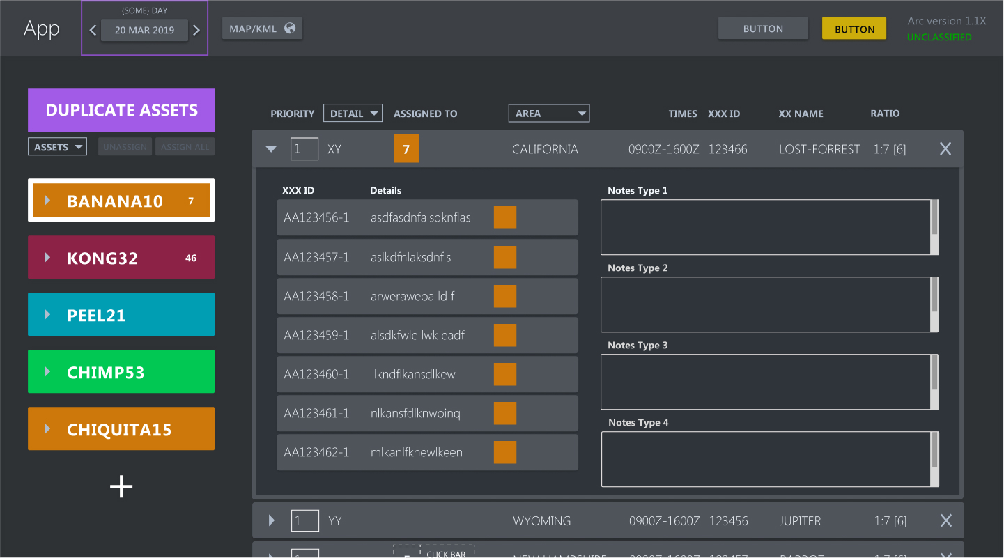
Details, data, and elements of the UI have been redacted and/or obscured for security protocol.
Dummy data has been added in replacement.
Usability solution 1: dedicated space for object details
I implemented a modal for editing an object's details. Users had no need to see details on the screen behind the modal, and the extra "breathing room" around the object details ensured no elements got missed.
Usability solution 2: differentiate "Duplicate Objects"
I changed the method for adding objects – both by duplication and by adding a new one. I put those related functions in the same space.
I added visual differentiation so those functions could not be confused with the objects themselves.
REASSESSING USABILITY
Users were thrilled with the UI improvements, and were able to complete their work in less time, with fewer errors.
2022. Katharine Britten Howard