case study
designing
A/B Testing
e-Commerce
battle planning
for Newbury Yarns
Security Disclaimer
In accordance with Government and USAF security protocol, product details, data, and elements of the product UI have been redacted and/or obscured.
Process at a Glance
PRODUCT OVERVIEW
Product Type:
USAF web application
Product Type:
e-Commerce web application
The App's General Problem Space:
Warfighters need a way to plan and manage air missions so that they can fulfill quotas and agendas efficiently and accurately.
Problem:
Knitters and crocheters need a way to browse and buy supplies online because they cannot always make it to the store to make their purchases.
Immediate Problem to Solve:
Planners are hampered by the existing two-step process to create plans.
It takes twice as much time as it could.
Additionally, planners need awareness on options and flexibility so that they can be creative and nimble with alternatives and make the best decisions.
User Experience Solution:
I believe that by creating an e-Commerce system for Newbury Yarns customers, we will make knitting and crochet shopping a more accessible, trustworthy, and personal experience.
Users

Warfighters with the job that requires them to make plans for which aircraft do which missions, and which missions should happen in a given day.
CHALLENGES & RESPONSIBILITY
My responsibility as a designer was to embody and deliver

Intense customer focus

Bias for action; be nimble and deliver quickly
Simplification where possible while innovating
There were two main challenges.
Each challenge had associated risks.

Challenge
Time. Users have a finite timeframe to deliver products to downstream operations.
Associated Risk
If a user cannot complete their workflow in time, adversaries may succeed.
Challenge
High volume. On any given day, users may have 2-3x as much work as other days, and the same amount of time to complete it.
Associated Risk
If we cannot create a scalable solution, the USAF will never be able to support the intensity of work associated with major theater war.
Meeting the Challenge:
My design pair and I elected to run an experiment: we'd produce a few options of designs to address the problem, and we'd A/B test them with our users.
Business Benefit:
e-Commerce will boost Newbury Yarns' position in the marketplace of suppliers, its integrity within the community, and its gross revenue.
RESEARCH & DISCOVERY
To meet the challenges quickly, I took action with user engagement on an experiment.
First, I identified information gaps that I needed to produce results that would solve the problem.
Then, I expedited the delivery of results by leveraging existing design patterns that met analogous problems in the private sector.
Interview Insights.
I interviewed 8 planners, deputies, and chiefs, and learned:
• Existing two-step process is cumbersome
• Existing process makes it hard to see incomplete missions
• Pairing multiple items to a task is a regular occurrence
• Pairing multiple items to a task adds 30% more time
• Existing process doesn't show optionality up front
Study the Company.
To design a sustainable e-Commerce platform for Newbury Yarns, I pursued learning about the business's:
• Values and mission
• Administration and staff
• Relationship with the community
• Revenue streams
• Product inventory

Inspiration.
I looked at a variety of other project management apps and considered:
• Layout options
• Data management paradigms
• Color, line, shape, and screen space
Study the Company.
To design a sustainable e-Commerce platform for Newbury Yarns, I pursued learning about the business's:
• Values and mission
• Administration and staff
• Relationship with the community
• Revenue streams
• Product inventory
This Trello layout meets similar needs!
A/B DESIGN
The Workflow.
My A/B (and C!) designs were based on the concept that the user needs to:
• Select an item from a list
• Assign the item to perform a task
• Associate a location with the task
• Associate a time for the task
The Design Must Account For
• Two items may be assigned to the task
• Arrangement by regions is required
• Ability to add task and item details
• Specific categories of tasks
• Efficiency to do 60+ pairings in 2 hours
I made clickable prototypes for our users to experience the new designs.
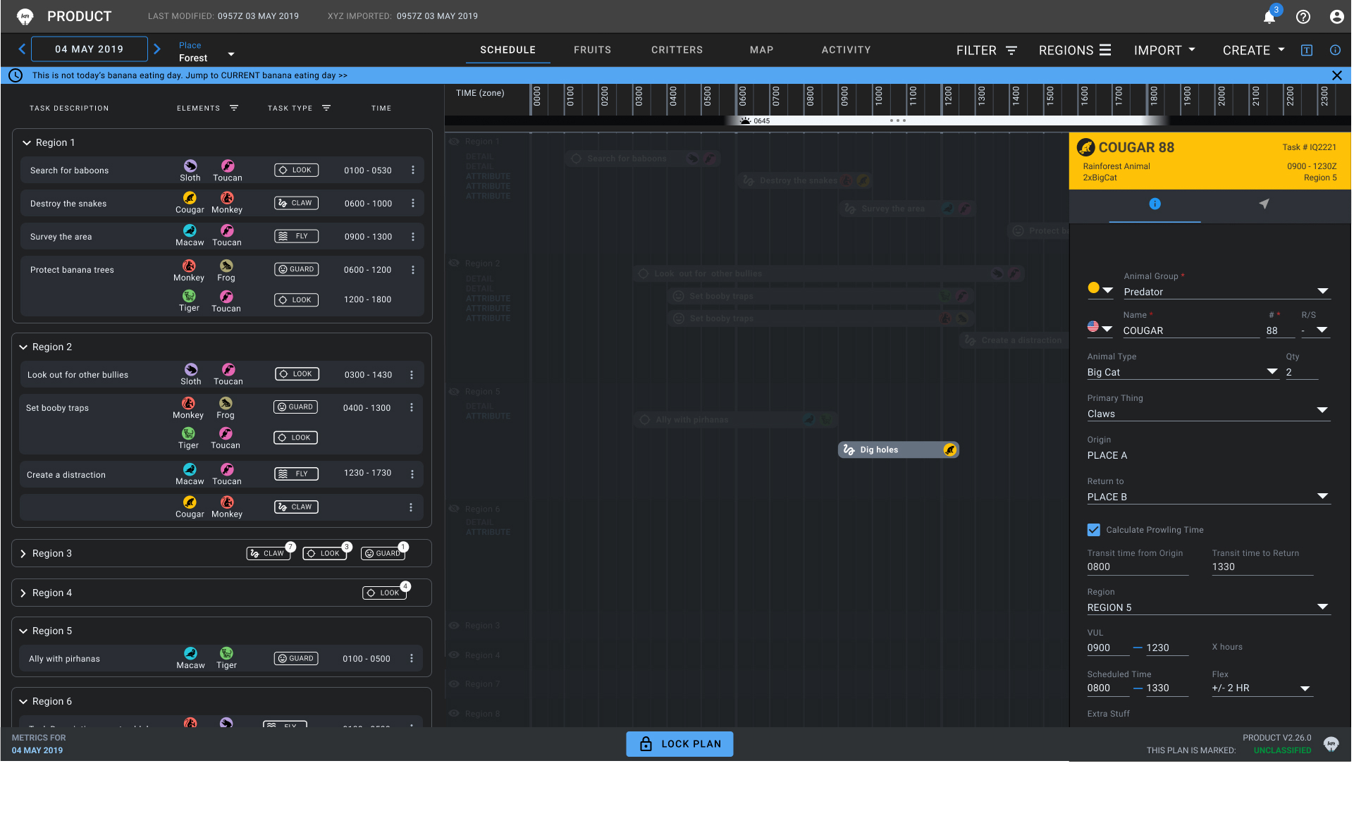
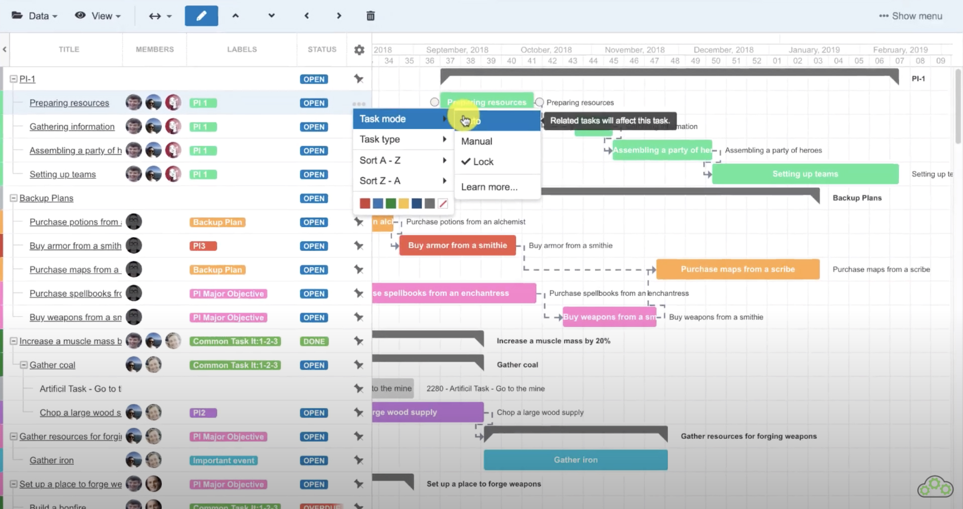
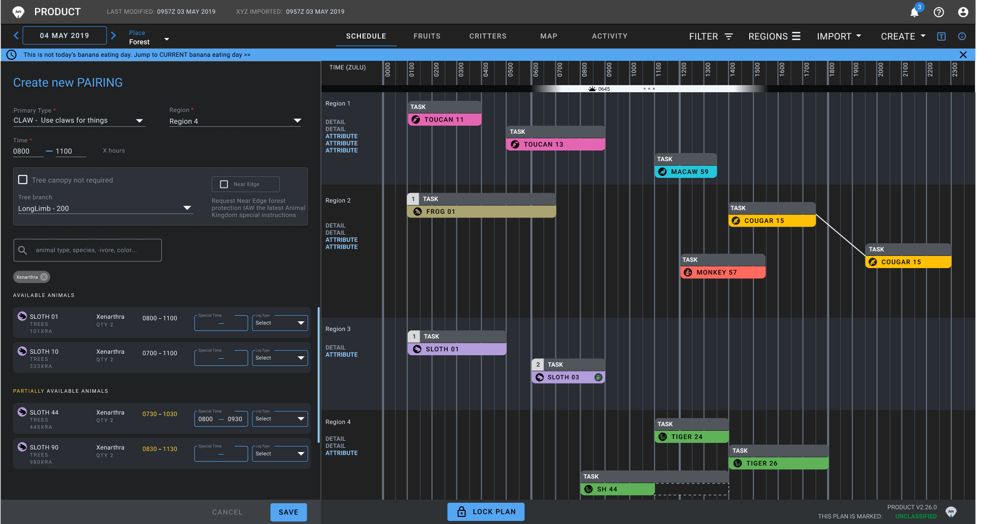
Design "A"
Details, data, and elements of the UI have been redacted and/or obscured for security protocol.
Dummy data has been added in replacement.
Design A.
I took the inspiration for the layout from a Trello feature, incorporating the broad side panel to hold more details per row.
This broader side panel, I thought, would be an improvement over the existing narrow side panel so that users could see more of their data in the panel, while keeping the Gantt-like view they like and are used to.
For the workflow of adding items to perform a task, I created a large modal which would allow a user to select a task and select items to perform it, all from one view. I believed this would solve the cumbersome problem of the existing two-step process.
I incorporated an omni filter to fast-track the ability to select appropriate items to perform the task, and the ability to select multiple items from the list the filter would produce.
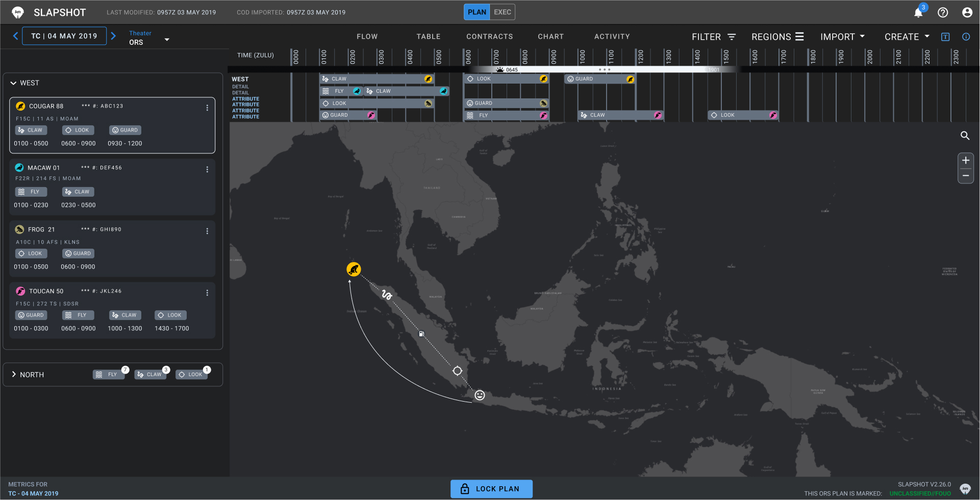
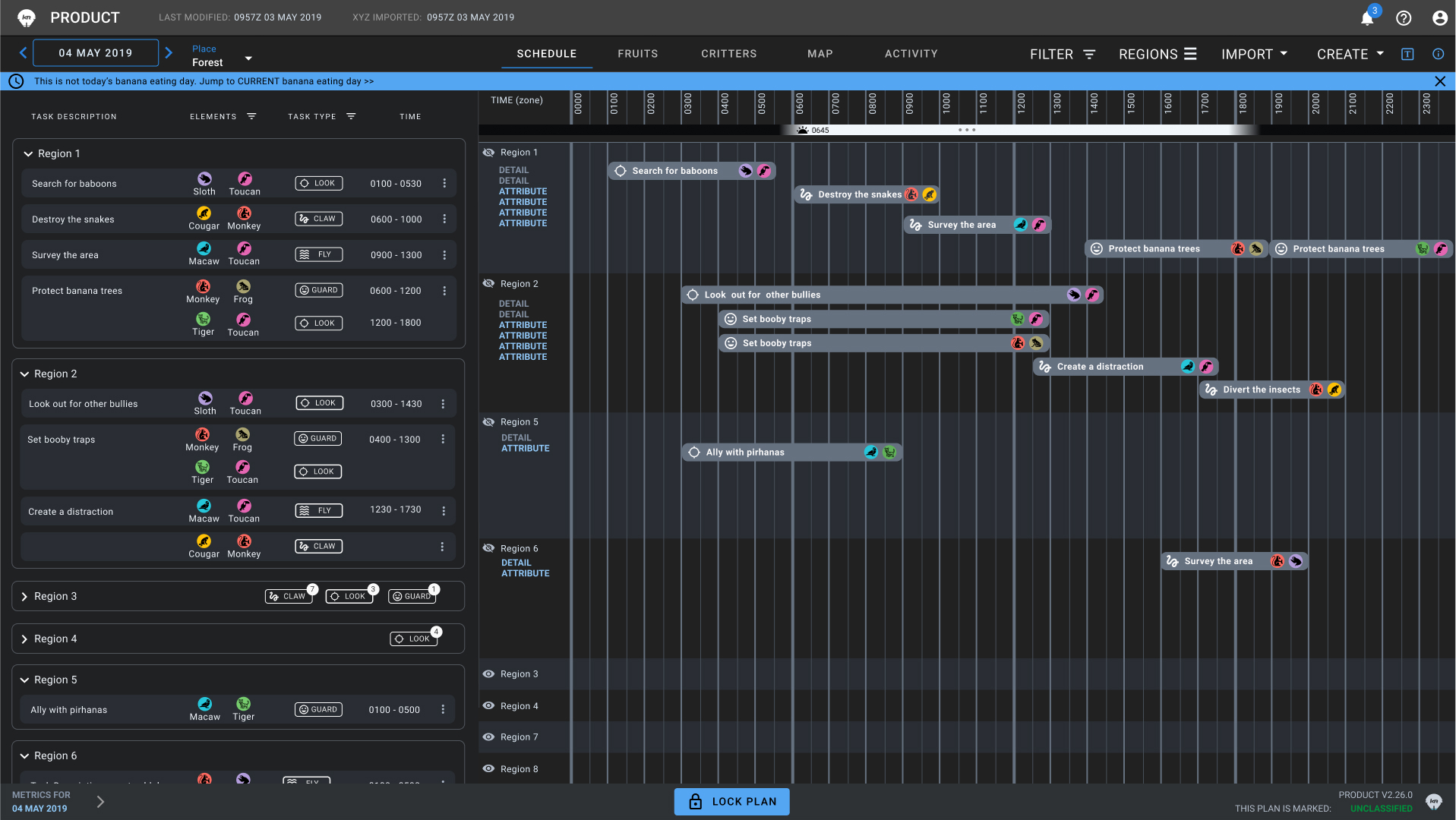
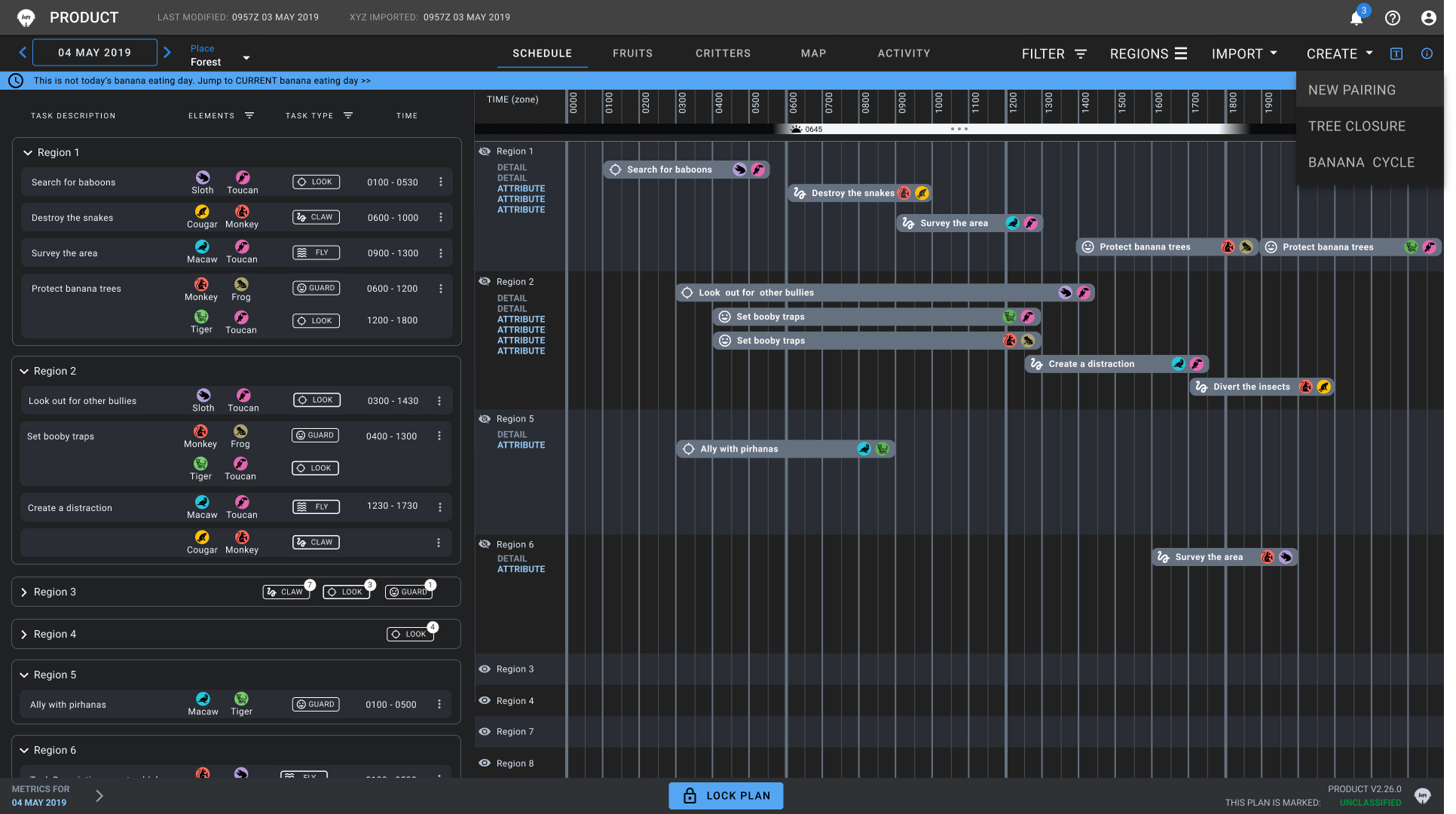
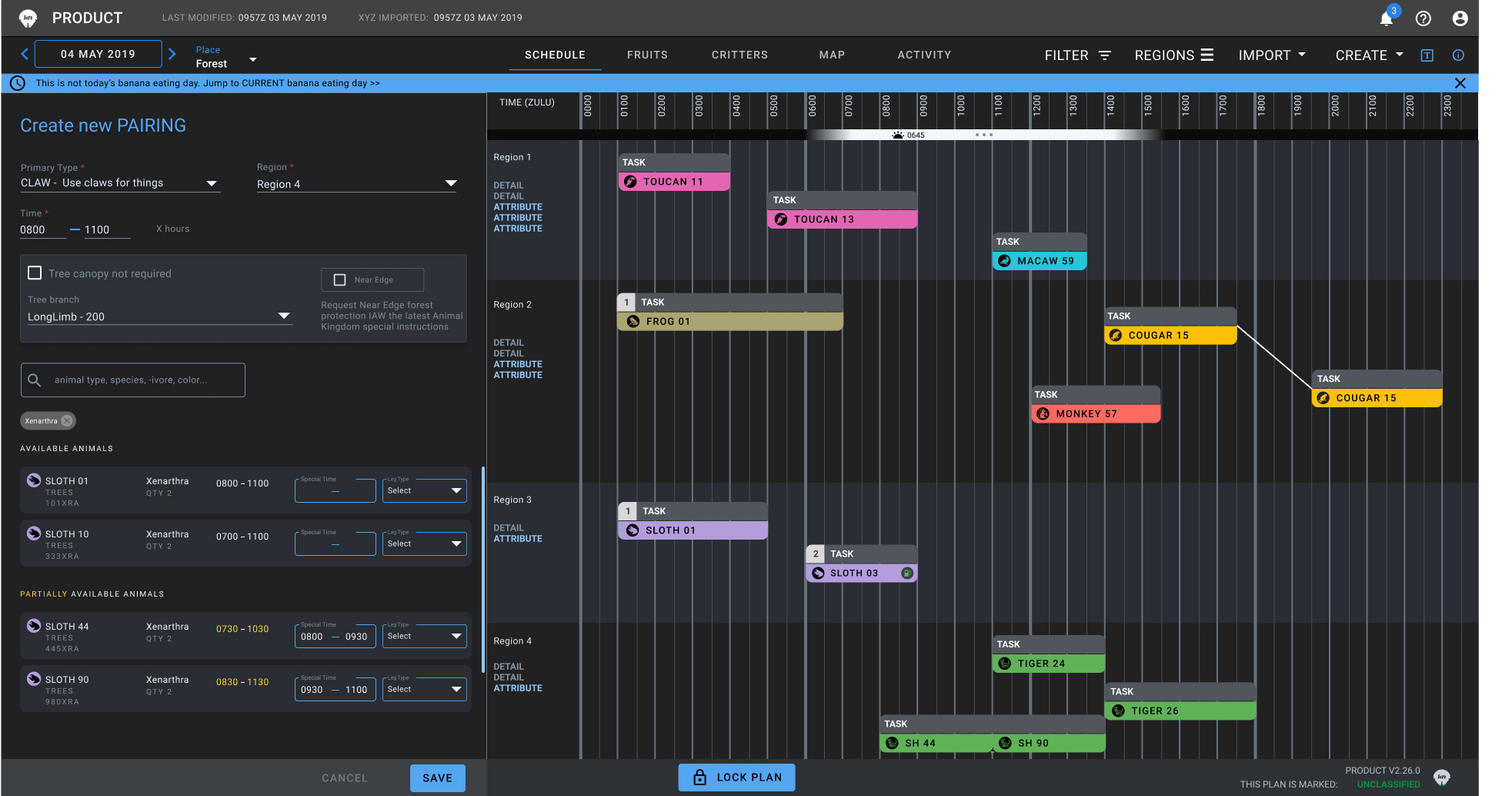
Design "B"
Details, data, and elements of the UI have been redacted and/or obscured for security protocol.
Dummy data has been added in replacement.
Design B.
I stuck with the side panel – broader than existing, but narrower than Design A. Users would still be able to see more data than the status quo, but not quite so much.
I kept the idea of the large modal to allow a user to select a task and select items to perform it, all from one view, with an omni filter to fast-track pairing items to tasks to select multiple items from the list the filter would produce.
I incorporated a large map so users could grasp the big picture and re-allocated the Gantt view to the top of the screen, which would correspond to the selected location. While a map wasn't a requirement, it was an ask I'd heard from our users before, and I didn't want to remove the Gantt completely, as I knew it was effective.
A/B TESTING & FEEDBACK

The bigger side panel is great; I can scroll easily and see a lot more information on the pairings.
I don't like the map. I know we always ask you for a map, but I'd rather stick with Gantt. It gives me more information for the space it occupies.
I'm not wild about the modal. I get that it gives a dedicated space to make a pairing, but it blocks things I might want to see while making it.
Results
• Validation that prototypes are a viable testing method with warfighter systems
• Validation that the new workflow did reduce time.
SYNTHESIS & RE-DESIGN
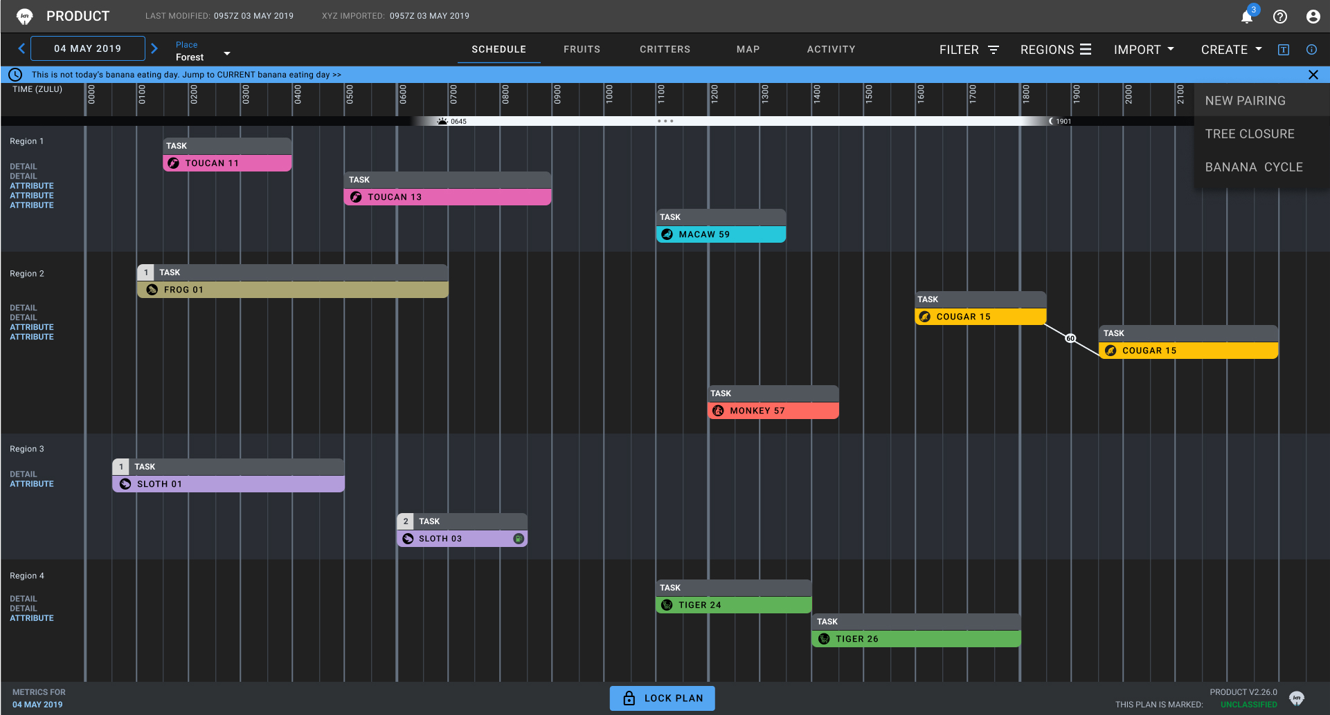
The results drove the decision to make "Design C", which has hybrid elements from Designs A and B:
Keep the big panel but...
Repurpose it to contain the task & item information from the modal for creating pairings. This panel is more extensible.
Ditch the modal.
Users loved the content, but when making a pairing they rely on the seeing the information a modal would block.
With Design C, users can create a pairing in one step with the new side panel, and have an unobscured view of the Gantt board when needing to create a pairing that requires two items per task.
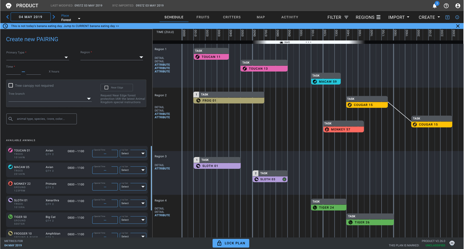
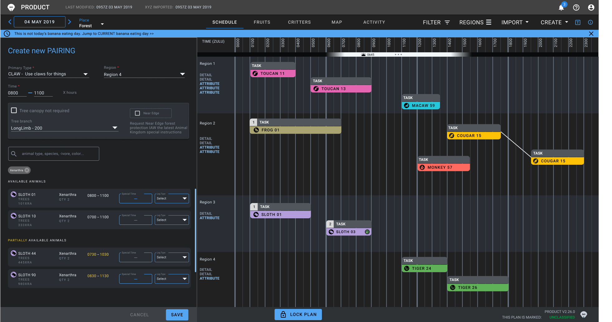
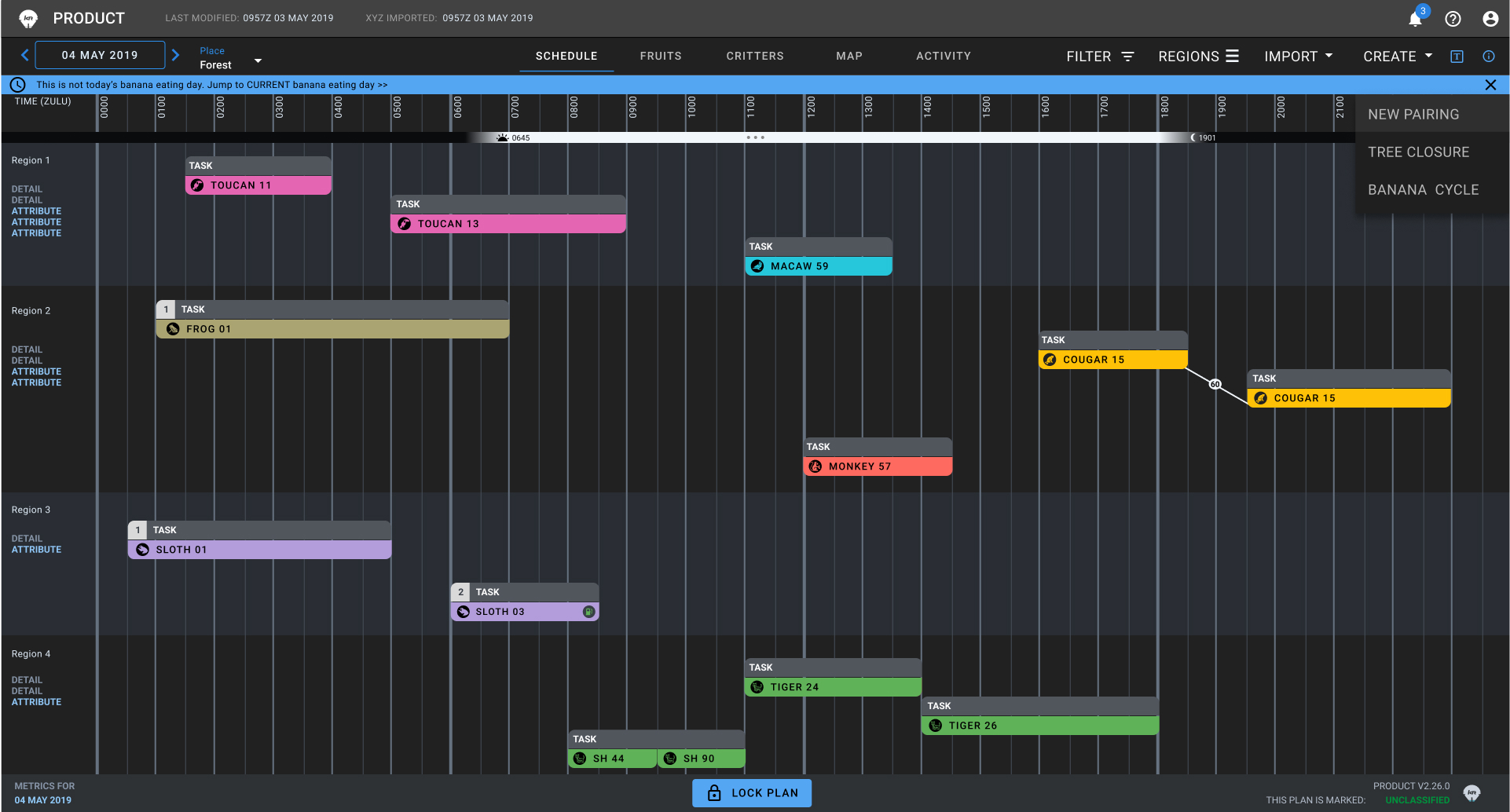
Design "C"
Details, data, and elements of the UI have been redacted and/or obscured for security protocol.
Dummy data has been added in replacement.
So...How did it go?
Major theater war capability was achieved in this aspect of our users workflow.
• Customers want guidance resources in two formats:
- pro-crafters who can talk about the products with firsthand knowledge, and
- self-guided help in size charts, tutorials, inspiration galleries, and self-built kits
• The target audience has a split opinion on price impact:
- 50% prioritize price point alone and are loyal to the lowest costs
- 50% are willing to pay more at brick & mortar shops because of the expert guidance and tactile experience.
• 100% of customers are adamant about touching a yarn before buying it in full
- 100% of customers voiced skepticism with yarn shopping online
• All interviewees said most purchases stem from seeing an inspiring display:
- finished knit/crochet projects, skeins in color arrangements, "featured" yarns, etc.
2022. Katharine Britten Howard